Choosing the perfect wall decal is exciting, but selecting the right size and placement is what makes your décor look intentional and balanced. A decal that fits your space well becomes a stylish focal point, while a poorly sized one may look lost or overwhelming. This practical guide will help you measure correctly, visualise layouts, choose colours that stand out, and ensure your decal sits at the right sight-lines.
For inspiration and to compare available styles, you can explore Kraftmatics’ collection on their
all products page.
1. Measure Your Wall Space Correctly
Measuring is the first step in choosing the right decal size. Start by determining:
- Total wall height and width
- Usable area, excluding doors, windows, switches, and shelves
- Eye-level height, usually around 57–60 inches from the floor
If you want the decal above furniture such as a couch, headboard, or study table, measure the empty wall space above it. A good rule is that the decal should cover about 40–60% of the open area so it looks cohesive and not cramped.
You can visit the Kraftmatics homepage to see how various sizes are displayed and styled across different rooms.
2. Visualise the Layout Before Applying
Visualising helps you avoid mistakes before installing the decal permanently.
Try Paper Templates
Cut newspaper or chart paper to the size of your chosen decal and tape it on your wall. This helps you see whether the size feels too big, too small, or just right.
Use Digital Mockups
Take a photo of your wall and sketch a rough outline of the decal using your phone’s editing tools.
If you need expert advice on sizing or placement, you can reach the team easily through the contact page.

3. Select the Right Placement
Placement changes the way your room feels and how your decal connects with the rest of the décor.
Living Room
Decals look best centered above a sofa or console table. Leave at least 6–10 inches of space above furniture for balance.
Bedroom
The most common spot is above the headboard. Make sure the decal doesn’t exceed the width of the bed. Smaller decals work well above side tables or as corner accents.
Home Office
Place motivational text at a comfortable eye-level when seated. This keeps it readable and visually pleasing.
Kids’ Room
Lower placements allow children to enjoy the design more closely.
You can browse more styling insights in Kraftmatics’ blogs section.
4. Choose the Right Colour and Contrast
Colour contrast plays a big role in making the decal visible and attractive.
- On light walls, use bold or darker colours
- On dark walls, pick bright or pastel colours
- Avoid colours too similar to your wall shade
Match your decal with existing accent colours—like rugs, cushions, or curtains—for a cohesive look.To understand the brand’s approach to clean, aesthetic design, explore the Our Vision page.
5. Ensure Readability and Sight-Lines
For text-based decals, readability is essential.
- Keep text at eye level
- Ensure it’s visible from the main standing or sitting position
- Avoid placing text behind tall furniture
- Leave 2–3 inches of free space around the decal
- Use larger decals in big rooms to avoid visual clutter
These steps ensure your wall art is not only beautiful but also functional.
6. Final Checks Before Applying
Before sticking the decal:
- Recheck measurements
- Use a level to ensure straight alignment
- Step back and view from different angles
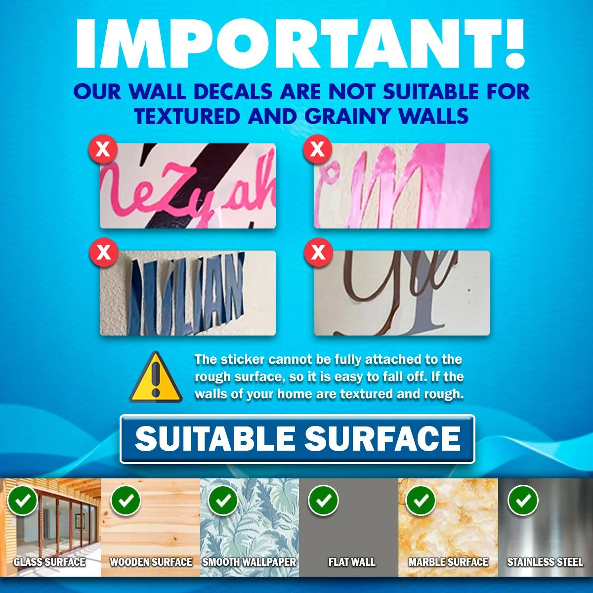
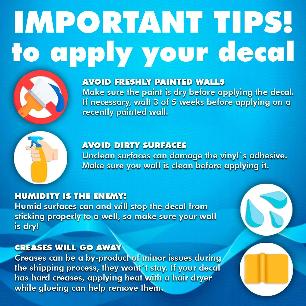
- Clean and dry the wall completely
These final steps help you avoid air bubbles and crooked placement.
Conclusion
Choosing the right size and placement for your wall decal can completely transform your room. With correct measurements, smart visualisation, thoughtful colour choices, and good sight-line positioning, your decal will feel like a natural and stylish part of your home.For more inspiration or to find your perfect design, explore the homepage or browse all available designs on the all products page.
If you ever need help, the Kraftmatics team is always available through their contact page
Recent Comments